Kuczaj Corpus Sentiment Analysis, pt 2
This past June, I did a sentiment analysis of the Kuczaj Corpus from the CHILDES database for my final project in a Data Visualization class taught by Alison Presmanes Hill, Steven Bedrick, and Jackie Wirz. During my presentation some of the questions that came up were: Does the total number of words per transcript vary a lot? How much is this effecting the sentiment analysis? What would happen to the plot if I normalized for transcript length?
The length of the transcripts does vary a great deal, both before and after processing and filtering against the nrc sentiment lexicon. I had actually noticed this artifact in the dataset when working on the project and had plans to address it. I ended up not having enough time to explore different normalization techniques and included a limitations section discussing how this could affect the visualizations I created.
Now, two months later, I am revisiting these questions and am going to find out what will happen if I normalize for transcript length!
Here are the packages that I will be using:
# Loading packages
library(tidyverse)
library(tidytext)
library(forcats)
library(skimr)
library(egg)
I saved the version of the dataset that I used to create the ridgeline density plots as a csv file so I could pick up where I left off.
# reading in data
kuczaj <- read_csv("data/kuczaj_nrc.csv")
Here’s a glimpse of what kuczaj looks like:
glimpse(kuczaj)## Observations: 22,893
## Variables: 4
## $ age_months <dbl> 29.00060, 29.00060, 29.00060, 29.00060, 29.00060, 29.00060…
## $ age_years <dbl> 2.416716, 2.416716, 2.416716, 2.416716, 2.416716, 2.416716…
## $ word <chr> "hurt", "hurt", "hurt", "hurt", "break", "cry", "cry", "ba…
## $ sentiment <chr> "anger", "fear", "negative", "sadness", "surprise", "negat…Since I only worked with the “trust”, “joy”, “anticipation”, “sadness”, “fear”, and “anger” sentiments last time, I am going to filter out all other sentiments from the dataframe. I’m also going to coerce sentiment to a factor and will order its levels with the positively associated ones before the negatively associated ones to make plotting easier later on.
# Sentiments to keep
sentiment_levels <- c("trust", "joy", "anticipation",
                      "sadness", "fear", "anger")

# Making sentiment a factor
kuczaj <- kuczaj %>%
  select(-age_years, -word) %>% # removing unneeded columns
  filter(sentiment %in% sentiment_levels) %>%
  mutate(sentiment = factor(sentiment, levels = sentiment_levels))
The transcripts were collected very frequently, so there end up being separate transcripts when Abe is 30.13204, 30.19775, and 30.32916 months old. There are 207 unique values of age_month alone. To make the data easier to plot, I chose to bin the observations together by taking the floor of age_months and then normalizing each unique age bin. This brings down the total unique values of age_month to 33, which will be a lot easier to plot. I also chose to remove the observations that fall into the edge age bins so that only “complete” bins are included.
# Taking the floor of age_months
ages_binned <- kuczaj %>%
  mutate(age_months = floor(age_months))


# Removing the two edge bins
ages_binned <- ages_binned %>%
  filter(age_months >= 29 & age_months <= 60)
To normalize by transcript length, for each of the age bins, I will count the total times each of the 6 sentiments is observed and then divide that number by the total number of sentiment tokens observed.
# Counting the number of sentiments
ages_binned <- ages_binned %>%
  add_count(age_months, sentiment) %>%
  rename(n_sentiment = n) %>%
  distinct(age_months, sentiment, .keep_all = TRUE)


# Adding in count for total tokens per transcript that were kept
ages_binned <- ages_binned %>%
  group_by(age_months) %>%
  mutate(n_tokens = sum(n_sentiment)) %>%
  ungroup()
Before I can move on to dividing n_sentiment by n_tokens, I first have to add in rows for when a sentiment is not observed for a particular age bin. Since I used add_count to calculate n_sentiment, I’m missing these 0 value rows in my dataframe currently. Using the expand() function from the tidyr package, I can create a dataframe, aux, that has all possible combinations of age_months, n_tokens and sentiment. I can then join this dataframe with my ages_binned dataframe to have rows for all 6 sentiments for each age bin.
# Creating the auxiliary table with all combinations
aux <- ages_binned %>%
  expand(nesting(age_months, n_tokens), sentiment)

# Merging aux with ages_binned
ages_binned2 <- aux %>%
  left_join(ages_binned, by = c("age_months", "n_tokens", "sentiment")) %>%
  replace_na(list(n_sentiment = 0)) # replacing NA values with 0
Now, I can normalize! I calculate the percent column by dividing the number of tokens of each sentiment for each age bin by the total number of tokens for that age bin overall.
# Normalizing!
ages_binned2 <- ages_binned2 %>%
  mutate(percent = n_sentiment/n_tokens)
It is important to note the number of tokens in each age bin varies a lot. How much does it vary?
ggplot(ages_binned2, aes(age_months, n_tokens)) +
geom_point() +
labs(title = "Total number of tokens per age bin") +
theme_minimal()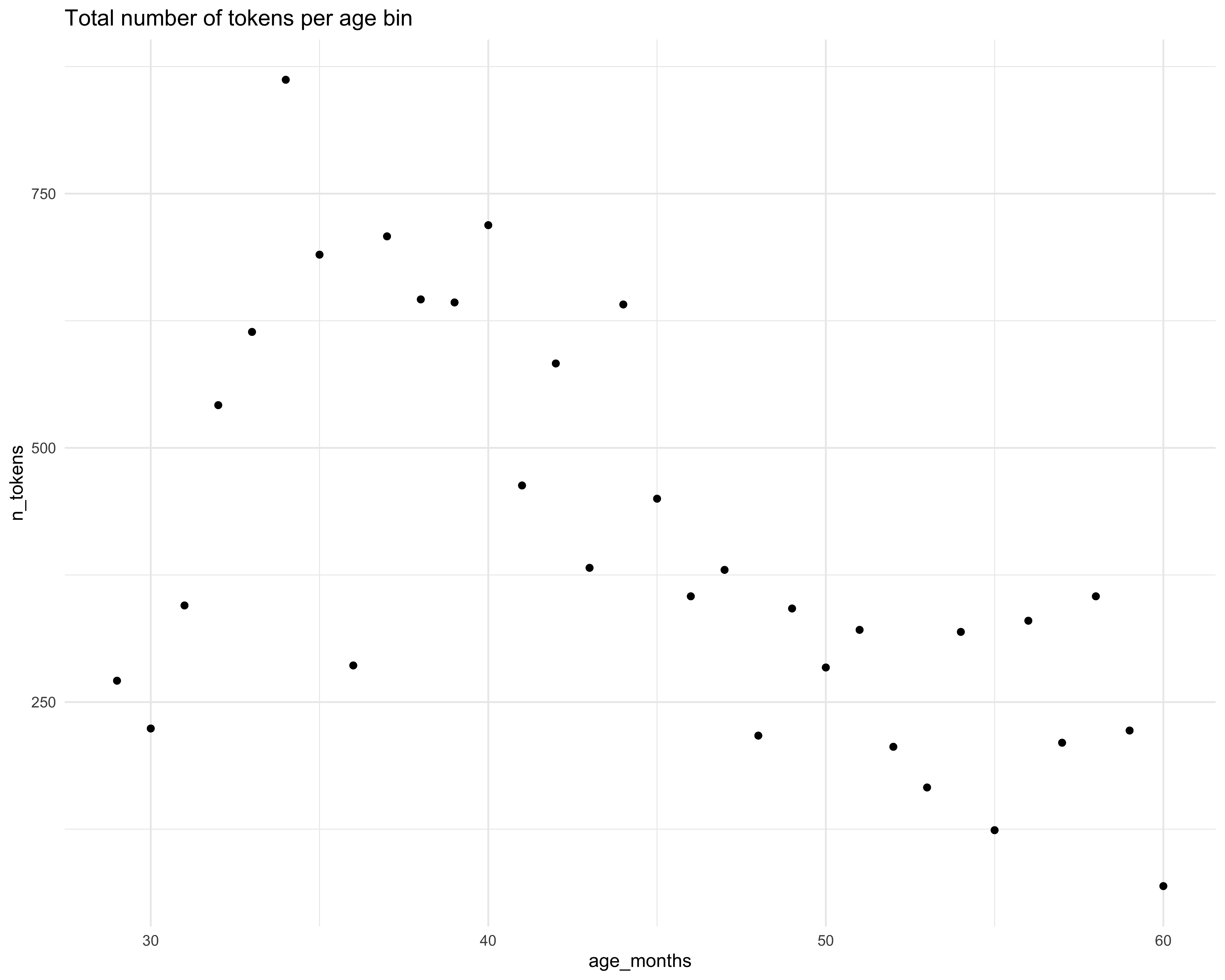 I decided to move forward for this iteration of the project without addressing this further but would ideally like to explore some weighting options in the future. So please just keep these limitations in mind when viewing the visualizations that follow.
To get orientated with the data I started by making this quick and minimal scatterplot.
ggplot(ages_binned2, aes(age_months, percent, color = sentiment)) +
  geom_point(alpha = 0.7) +
  facet_wrap(~ sentiment) +
  guides(color = FALSE) +
  theme_minimal()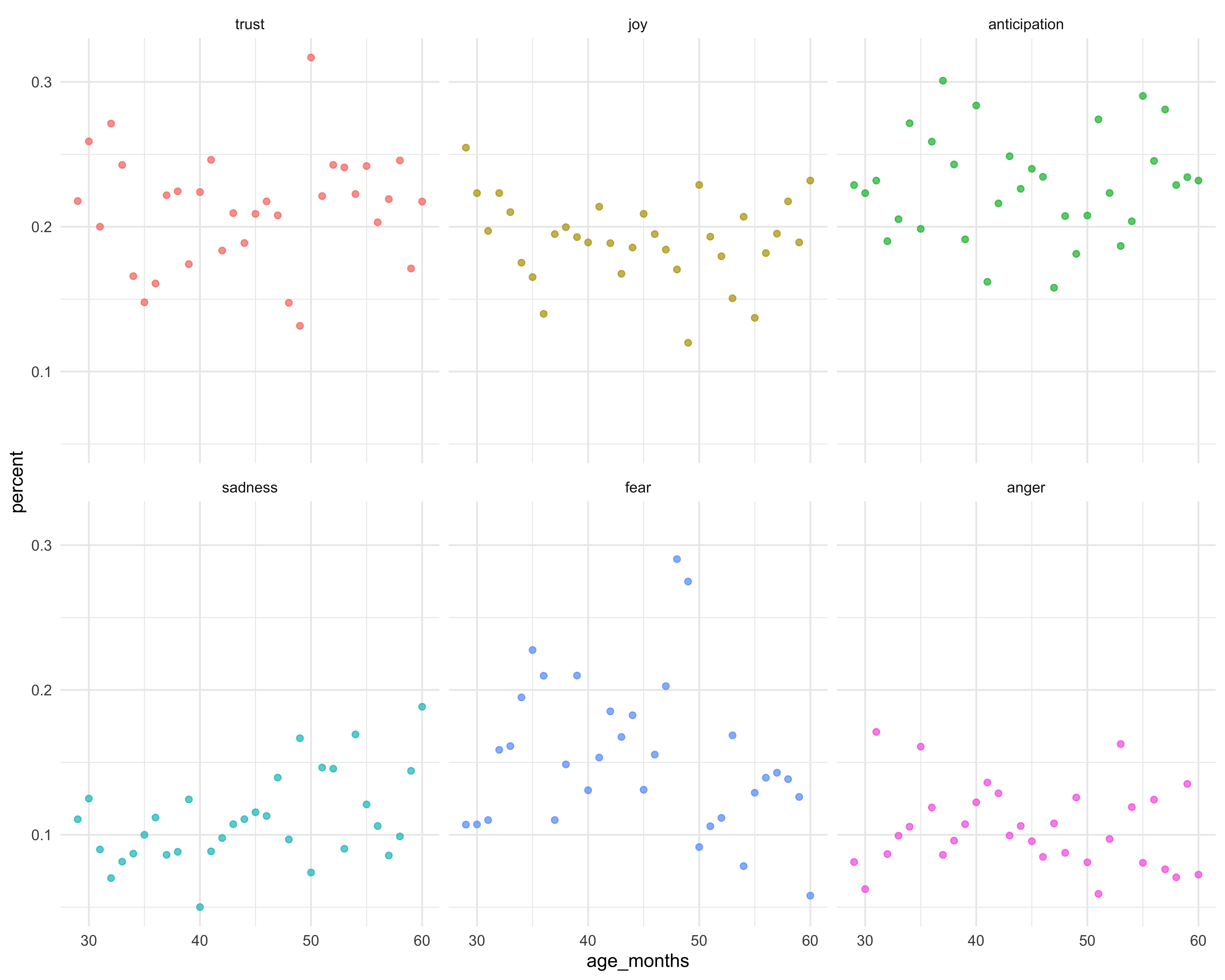
…and then on second thought, I decided to switch over to a bar chart.
ggplot(ages_binned2, aes(age_months, percent, fill = sentiment)) +
  geom_col(alpha = 0.7) +
  facet_grid(sentiment ~ .)+
  guides(fill = FALSE) +
  theme_minimal()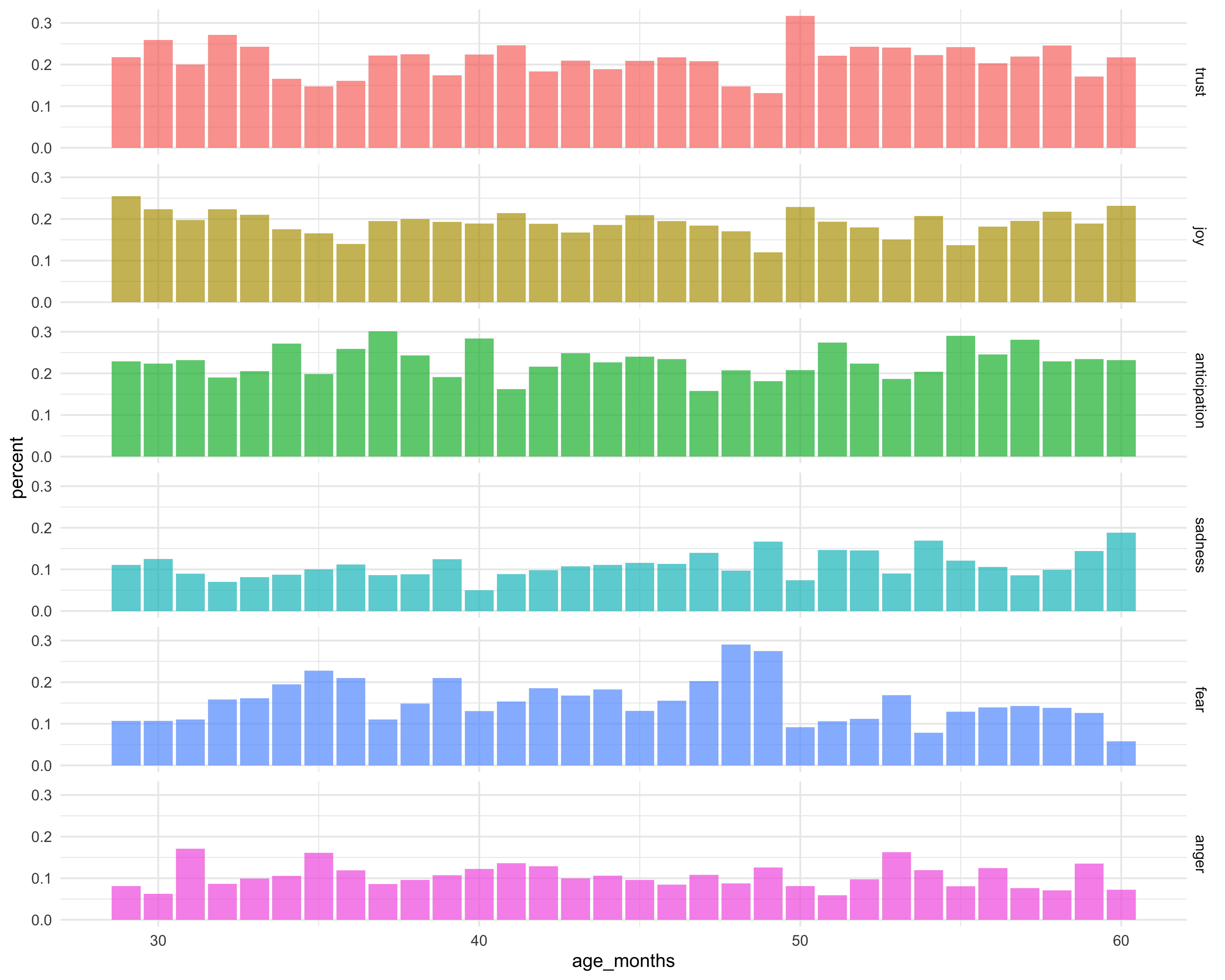
This looks better, but having all six plots in one column makes the plots look a little cramped. What if I used a facet_wrap on sentiment?
ggplot(ages_binned2, aes(age_months, percent, fill = sentiment)) +
  geom_col(alpha = 0.7) +
  facet_wrap(~ sentiment) +
  theme_minimal() +
  labs(x = "", y = "") +
  guides(fill = FALSE)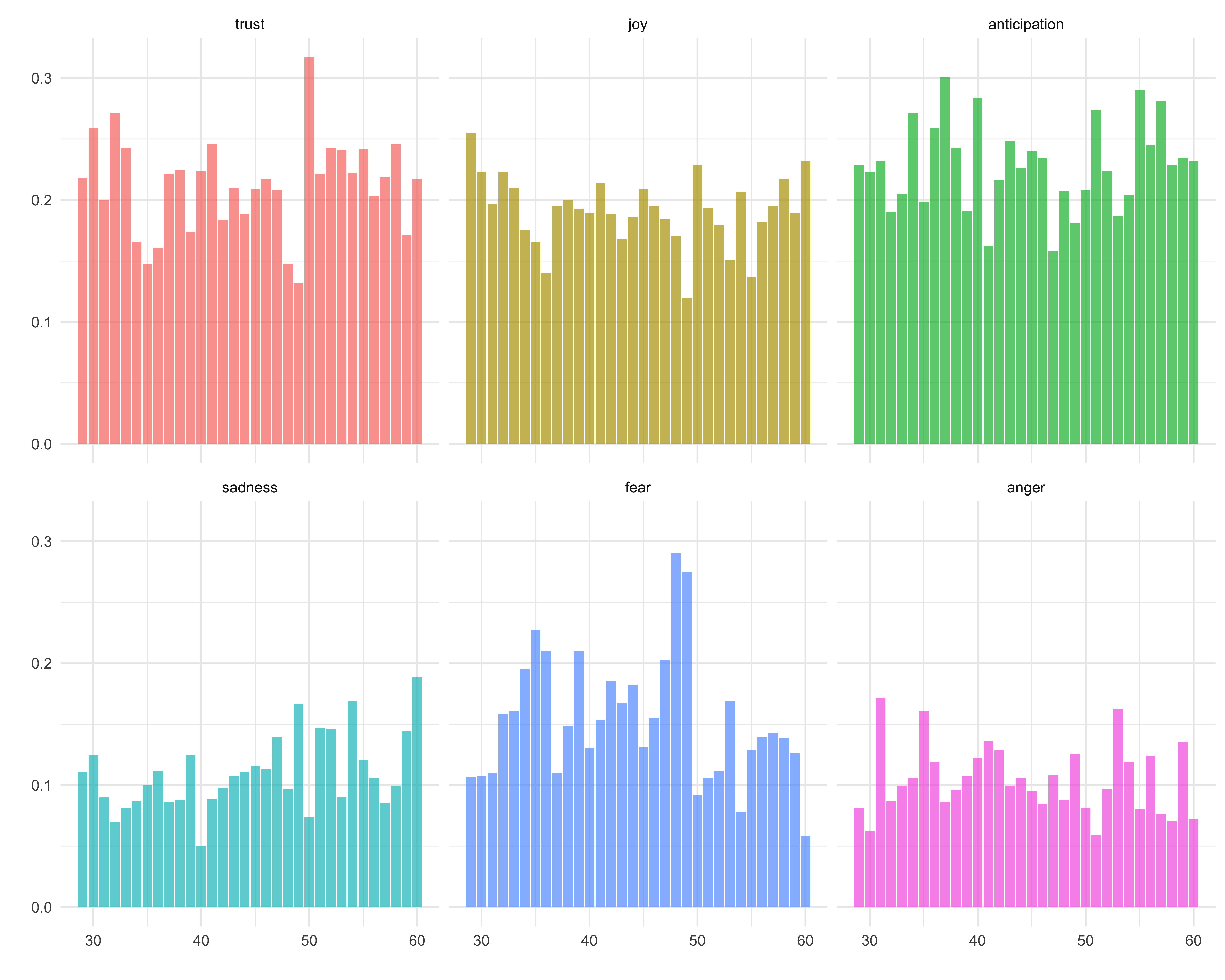
…what if I switch the orientation and add in some colors?
positive_plot <- ages_binned2 %>%
filter(sentiment %in% c("trust", "joy", "anticipation")) %>%
ggplot(aes(age_months, percent, fill = sentiment)) +
geom_col(alpha = 0.7, color = "white") +
facet_wrap(~sentiment, ncol = 1, scale = "free_x") +
theme_minimal() +
labs(x = "", y = "", title = "Kuczaj Corpus & Sentiment") +
guides(fill = FALSE) +
scale_fill_manual(values = c("#97B8C7", "#AEC9C3", "#7FCCD3"))
negative_plot <- ages_binned2 %>%
filter(sentiment %in% c("sadness", "fear", "anger")) %>%
ggplot(aes(age_months, percent, fill = sentiment)) +
geom_col(alpha = 0.7, color = "white") +
facet_wrap(~sentiment, ncol = 1, scale = "free_x") +
theme_minimal() +
labs(x = "", y = "") +
guides(fill = FALSE) +
scale_fill_manual(values = c("#21132B", "#4F406E", "#6C7399"))
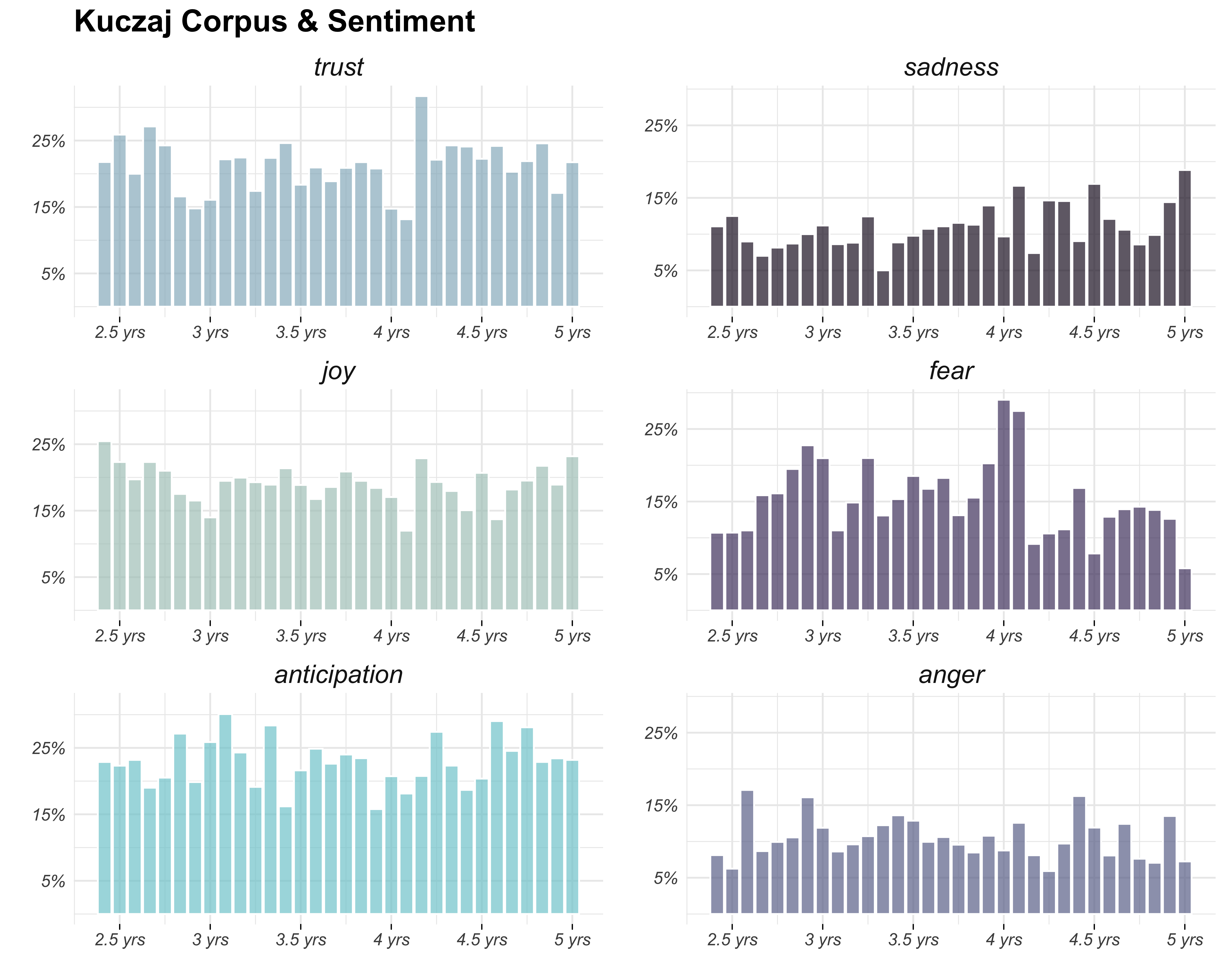
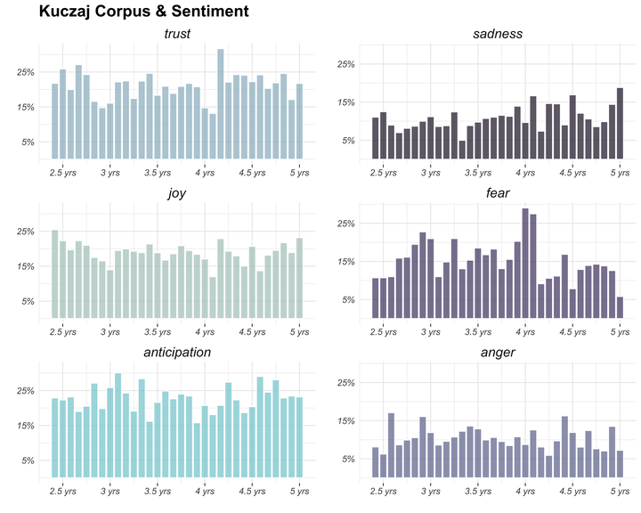
ggarrange(positive_plot, negative_plot, ncol = 2, nrow = 1)
Okay, I like this one a lot more. Now let’s customize the axis tick breaks and labels.
positive_plot2 <- positive_plot +
  scale_y_continuous(breaks = c(0.05, 0.15, 0.25),
                     labels = c("5%", "15%", "25%")) +
  scale_x_continuous(breaks = c(30, 36, 42, 48, 54, 60),
                     labels = c("2.5 yrs", "3 yrs", "3.5 yrs",
                                "4 yrs", "4.5 yrs", "5 yrs"))

negative_plot2 <- negative_plot +
  scale_y_continuous(breaks = c(0.05, 0.15, 0.25),
                     labels = c("5%", "15%", "25%")) +
  scale_x_continuous(breaks = c(30, 36, 42, 48, 54, 60),
                     labels = c("2.5 yrs", "3 yrs", "3.5 yrs",
                                "4 yrs", "4.5 yrs", "5 yrs"))


ggarrange(positive_plot2, negative_plot2, ncol = 2, nrow = 1)
…and finally let’s change the font face and add in tick marks!
positive_plot3 <- positive_plot2 +
  theme(plot.title = element_text(size = 18, face = "bold"),
        strip.text = element_text(size = 15, face = "italic"),
        axis.text.x = element_text(size = 10, face = "italic"),
        axis.text.y = element_text(size = 10, face = "italic"),
        axis.ticks.x = element_line())

negative_plot3 <- negative_plot2 +
  theme(strip.text = element_text(size = 15, face = "italic"),
        axis.text.x = element_text(size = 10, face = "italic"),
        axis.text.y = element_text(size = 10, face = "italic"),
        axis.ticks.x = element_line())

ggarrange(positive_plot3, negative_plot3, ncol = 2, nrow = 1)