Kuczaj Corpus Sentiment Analysis, pt 1
Ridgeline Plot
Description of the Data
Over the past few weeks of my research I have been wrangling and exploring a subset of data from the Child Language Data Exchange System (CHILDES), an enormous online repository of language acquisition data that is available online for free. The data that I have been studying is a subset of 14 corpora from the Eng-NA section of CHILDES. The Eng-NA section contains 50+ individual corpora with language acquisition data of exclusively North American English.
Though I have spent a lot of time with this dataset, I haven’t had many opportunities to visualize it yet. For my final visualization project, I decided to work with one of the 14 corpora that I have been exploring, the Kuczaj Corpus. The Kuczaj Corpus contains transcripts of spontaneous speech collected during a longitudinal case study conducted by Stan Kuczaj on his son, Abe. Kuczaj was studying the acquisition of certain verb inflections. The study took place from 1973-1975, when Abe was 28 months old to 60 months old.
Creating the Visualization
The raw data used for this project was gathered from the CHILDES database via the childesr package. Since I was interested in examining the speech of Abe, I pulled down all of his utterances across the entire corpus.
# Loading packages
library(childesr)
library(magrittr)
library(tidytext)
library(ggridges)
library(ggplot2)
library(stringr)
library(dplyr)
library(tidyr)
library(egg)
# Pulling down the raw utterances from the childes db
kuczaj_raw <- childesr::get_utterances(collection = "Eng-NA",
corpus = "Kuczaj",
role = "Target_Child")Before I could begin making my visualization, there was quite a bit of data organizing and data cleaning that had to be done first. I started by rearranging the raw dataframe, kuczaj_raw, and removed any columns that I would not be needing later on. Unlike other corpora included in the CHILDES database, the Kuczaj Corpus only has one target child. A lot of the metadata about the corpora and the texts was not needed because of this, and I only ended up keeping two columns: gloss (the utterance) and target_child_age (age at time of utterance in months). After reorganizing the columns, I made sure to filter out any missing utterances that there might be in the dataset.
# Rearrange/renaming columns and removing missing utterances
kuczaj <- kuczaj_raw %>%
  select(utt = gloss, age_months = target_child_age) %>%
  drop_na(utt) %>%
  filter(utt != "")
Once the reorganization was finished, I began working on cleaning the data. I standarized all contractions that occured. Contractions were either expanded or collapsed, depending on whether they were an exception case or a general case. I made a subjective decision to remove all occurences of 's, since its grammatical meaning is ambiguous: it can either signify a possessive 's or a collapsed is.
In addition to processing contractions, I also removed all underscores (used to signify a phrase), and converted all characters to lowercase.
# Creating a function to process contractions

proc_contractions <- function(string) {
  string %<>%
    # Expanding the exception cases
    str_replace_all("won't", "will not") %>%
    str_replace_all("can't", "can not") %>%
    str_replace_all("c'mon", "come on") %>%
    str_replace_all("let's", "let us") %>%
    str_replace_all("shan't", "shall not") %>%
    str_replace_all("y'all", "you all") %>%

    # Collapsing "o'clock" bc the expansion, "of the clock" is uncommon/archaic
    str_replace_all("o'clock", "oclock") %>%

    # Collapsing "ain't" bc the expansion is ambiguous
    str_replace_all("ain't", "aint") %>%

    # Expanding the general cases
    str_replace_all("'m", " am") %>%
    str_replace_all("n't", " not") %>%
    str_replace_all("'ll", " will") %>%
    str_replace_all("'d", " would") %>%
    str_replace_all("'ve", " have") %>%
    str_replace_all("n'ts", " nots") %>%
    str_replace_all("'re", " are") %>%

    # Removing all "'s" bc the expansion is ambiguous (possessive or " is")
    str_replace_all("'s", "") %>%

    # Catching any missed apostrophes
    str_replace_all("'", "")

  return(string)
}
# Processing utterances
kuczaj$utt %<>%
# Removing all underscores
str_replace_all("_", " ") %>%
# Processing contractions
proc_contractions() %>%
# Changing all characters to lowercase
str_to_lower()Since the age of a person is typically quantified and referred to in years instead of months, I decided to convert the unit that records age in the dataframe to years instead of months.
# Adding a column with age in years
kuczaj %<>%
  mutate(age_years = age_months/12)
Next, I unnested the utterances into tokens. For this visualization I chose to tokenizing the text into unigrams using the unnest_tokens() function from the tidytext package.
# Tokenizing into unigrams
tokens_raw <- kuczaj %>%
  unnest_tokens(output = word, input = utt)
Since text data can be difficult to visualize raw, especially if you have a lot of it, I chose to visualize the emotion in the text. I performed a sentiment analysis with the "nrc" sentiment lexicon included in the tidytext package. The NRC Word-Emotion Association Lexicon (2013) classifies words into 10 different sentiment categories: anger, anticipation, disgust, fear, joy, negative, positive, sadness, surprise, and trust.
After initializing the lexicon, I combined it with the tokens using an dplyr::inner_join. Only the tokens that occured in both dataframes were kept, while all other tokens were removed.
# Initizalizing "nrc" sentiment lexicon
nrc <- tidytext::get_sentiments("nrc")

# Merging together tokens and nrc
nrc_df <- tokens_raw %>%
  inner_join(nrc, by = "word")
As is typical and potentially problematic of sentiment lexicons, a lot of words ended up being omitted. The total number of tokens changed from 167833 to 22893, with 144940 tokens lost.
And finally, making the plot!
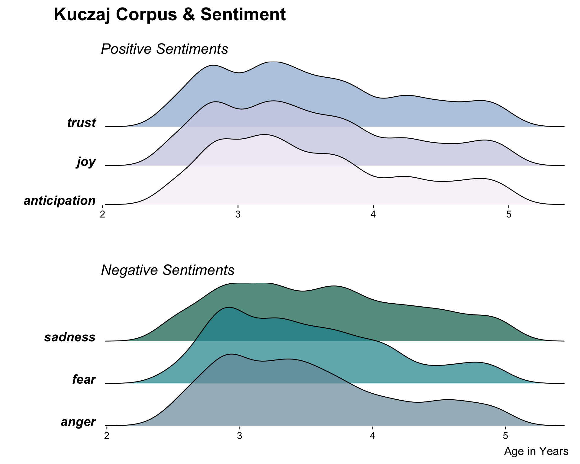
I decided to restrict the sentiment categories from 10 to 6, and grouped these 6 into emotions that associated with a positive sentiment – joy, trust, and anticipation – and emotions that are associated with a negative sentiment – anger, sadness, and fear. The creation of these groupings was mostly a subjective decision that was partially motivated from exploring the most common sets of emotions as illustrated on the NRC Word-Emotion Association Lexicon
To make the actual ridgeline plot, I used the geom_density_ridges() extension to ggplot(), provided in the ggridges package. I created the ridgeline plot of the positive and negative sentiment groups separately, and then combined them together using the ggarrange() function from the egg package.
# Making the plot!

# Creating the positive subplot
positive_plot <- nrc_df %>%
  filter(sentiment %in% c("joy", "trust", "anticipation")) %>%
  ggplot(aes(x = age_years, y = sentiment, fill = sentiment)) +
    geom_density_ridges(alpha = 0.8, show.legend = FALSE) +
    labs(x = "", y = "", title = "Kuczaj Corpus & Sentiment",
         subtitle = "\nPositive Sentiments") +
    scale_y_discrete(expand = c(0.01, 0)) +
    scale_x_continuous(expand = c(0.01, 0)) +
    scale_fill_manual(values = c("#F6EFF7", "#D0D1E6", "#A6BDDB")) +
    theme_ridges(grid = FALSE) +
    theme(plot.title = element_text(size = 22, hjust = -0.2),
          plot.subtitle = element_text(size = 18, face = "italic"),
          axis.text.y = element_text(size = 16, face = "bold.italic"))

# Creating the negative subplot
negative_plot <- nrc_df %>%
  filter(sentiment %in% c("anger", "sadness", "fear")) %>%
  ggplot(aes(x = age_years, y = sentiment, fill = sentiment)) +
    geom_density_ridges(alpha = 0.7, show.legend = FALSE) +
    labs(x = "Age in Years", y = "", title = "",
         subtitle = "Negative Sentiments") +
    scale_y_discrete(expand = c(0.01, 0)) +
    scale_x_continuous(expand = c(0.01, 0)) +
    scale_fill_manual(values = c("#7999A8", "#1C9099", "#016C59")) +
    theme_ridges(grid = FALSE) +
    theme(plot.subtitle = element_text(size = 18, face = "italic"),
          axis.text.y = element_text(size = 16, face = "bold.italic"))

# Combining into one and plotting
egg::ggarrange(positive_plot, negative_plot, ncol = 1, nrow = 2)
Description of the Audience
Since this data comes from a larger dataset that I am currently exploring in my research, potential audiences for this visualization might include my advisor, my colleagues, and other faculty at CSLU. In fact, I actually am planning on showing this visualization to my advisor tomorrow morning. As for as potential audiences in a more general sense, this might include students or researchers interested in natural language processing, text mining, language acquisition, and sentiment analysis.
Description of the Graph Type
A ridgeline plot visualizes the distribution of various groups, either as density plots or histograms, with the individual plots staggered vertically on a common x-axis and slightly overlapping each other. They are typically used to visualize how the aspects of a categorical variable change over time or space.
Representation Description
I had never conducted any form of sentiment analysis on language acquisition data from CHILDES before and was curious if there would be any trends in sentiment types as the child grew older. Would he use more words that were associated with joy as he grew older? Would he use less? Would there be no discernable difference?
After narrowing down the sentiment categories from ten to six, I chose to group the remaining ones into a “positive” group and a “negative” group. I made this decision after first plotting all six sentiments in one graph and seeing how difficult it was to read the plot at a quick glance. I thought that breaking the sentiments into two groups would make the information shown by the plot not only easier to read, but would it easier to make comparisons across categories by providing some order.
How to Read it & What to Look For
Since the differences between sentiments are for the most part subtle, I find it easiest and most interesting to read this plot by first choosing two specific categories, and then comparing them to each other. Since the y-axis of this plot is a categorical variable, more information can be gathered if looking at subsections of the plot separately instead of looking at the entire plot at once.
Presentation
General Composition: To reinforce the grouping of the sentiments into “positive” and “negative”, I chose to plot the two groups separately and stacked vertically. This preserved the common x-axis that is an essential characteristic of ridgeline plots, while also breaking apart plot making it easier to read.
Color: Choosing the colors for this plot was difficult. I wanted to reflect the separation of sentiments into two groups while also being sure to emphasize that the sentiments were still categorical and not ordered. I tried to capture this with the colors by using a diverging color palette of distinct colors.
Annotation: I used theme_ridges() first with further customization of the theme afterwards. I chose to make the sentiments in bold and italicized to highlight the categories, and included subtitles of “Postiive Sentiments” and “Negative Sentiments” to show the grouping. Since the x-axis is the same for both plots, I chose to only include the y-axis label for the bottom plot.
Limitations
This plot is the result of an purely exploratory analysis venture that was limited by time constraints and not the result of an indepth, thorough analysis. Due to a lack of time, I was unable to normalize the data for differences in total word count across transcript. Any trends that this plot suggests may be due to confounding factors that were not controlled during analysis. Thus, this plot may not be an entirely accurate representation of the true nature of the dataset.
An Early Draft
This is an early draft plot that came before the sentiments were grouped into “positive” and “negative” and before I altered the general plot composition and colors. I had already chosen to reduce the total number of sentiments, but had only reduced it down to 8 for this plot. I decided to separate the sentiments into positive and negative groups and realizing that having them all on the same plot made it difficult to understand what was the plot was showing at a first glance.
# Using the beyonce package for colors
# devtools::install_github("dill/beyonce")
library(beyonce)

# Making the plot
nrc_df %>%
  filter(!sentiment %in% c("positive", "negative")) %>%
  ggplot(aes(x = age_years, y = sentiment, fill = sentiment)) +
    geom_density_ridges(alpha = 0.8, show.legend = FALSE) +
    labs(x = "Age in Years", y = "", title = "Kuczaj Corpus & Sentiment") +
    scale_y_discrete(expand = c(0.01, 0)) +
    scale_x_continuous(expand = c(0.01, 0)) +
    theme_ridges(grid = FALSE) +
    scale_fill_manual(values = beyonce_palette(64))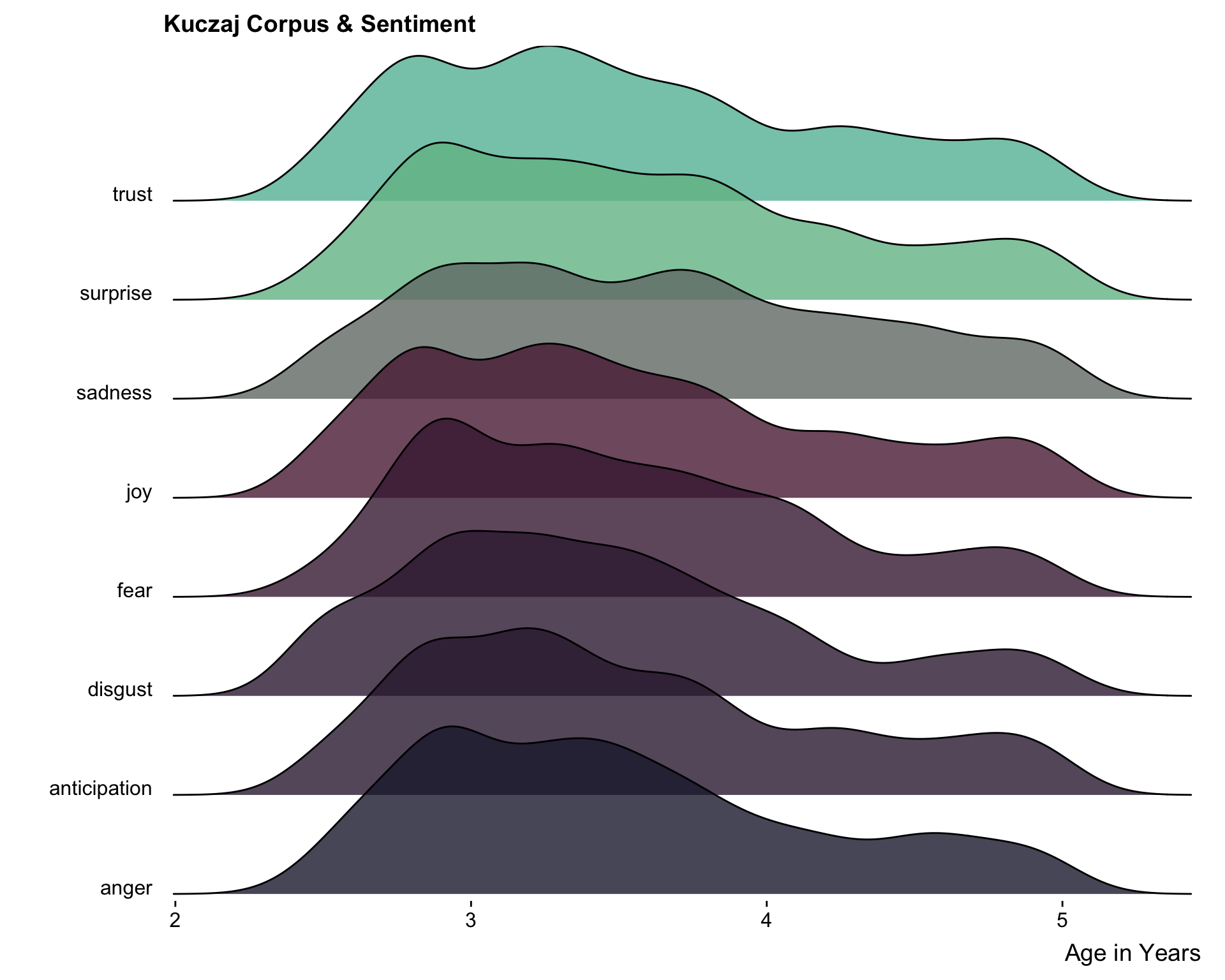
Mohammad, Saif M., and Peter D. Turney. 2013. “Crowdsourcing a Word-Emotion Association Lexicon.” Computational Intelligence 29 (3): 436–65. https://doi.org/10.1111/j.1467-8640.2012.00460.x.